Our connection to colour is hard to understand, yet it’s impossible to deny. Colour has the ability to inspire a variety of emotions, from social to thoughtful to restful, just by virtue of where it lands on the spectrum. Colour has the power to make or break a room. This is why we, as interior designers, love working with colour. On the other hand, this is also the reason so many people are hesitant to use it in their homes.
Want to dip your toe in the paint pool, but not sure where to start? Draw your colour inspiration from something that visually appeals to you. This could be a great piece of art, a fabric swatch that caught your eye, or a photograph. The beauty of this exercise is that there’s really no wrong answer. If you love it, then it’s right.
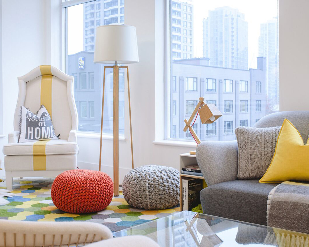
This stunning urban home (pictured above) features high ceilings, ample windows and bright natural light. We enhanced these wonderful attributes of space and light with a contemporary colour palette of off-white, grey and yellow, applied using the tried-and-true 60-30-10 Rule. These are the proportions in which your tri-colour palette should be divvied up, in order to achieve good balance.
The “dominant colour” is the one that covers the most area – about 60 per cent, most commonly on the walls. Neutral colours are a popular preference, given the large area of coverage, chosen for their versatility and longevity. In this space, we opted for a fresh off-white colour on the walls, the which is elegant and urban; trendy yet timeless. White is well suited to rooms with a variety of textures and finishes.
The “secondary colour” is next in line, occupying 30 per cent of the space. This is used to contrast the dominant hue, to make the space really “pop.”
We chose a warm medium grey for furnishings and the rug underfoot, as a sharp contrast to the white backdrop without the heaviness of black. Grey is conservative, reliable and assuring, generally a great option in living rooms, bathrooms, dining rooms. Grey also happens to be another trending neutral these days, so it delivers the trend factor with the eternal appeal of a neutral colour. The accent colour comes in the smallest and arguably punchiest doses. This colour will occupy the remaining 10 per cent of your space. Go ahead and be bold! Intriguing accent pieces, artwork and textiles are a great way to introduce a vibrant shade. Bonus: this is easy and cost-efficient to change, since it’s only 10 per cent of your space.
In this room, yellow is our accent colour of choice. This sunny hue appears in small doses, but it’s enough to instantly warm up the home’s overarching contempo-cool vibe. Yellow is stimulating, and a perfect choice for living areas, laundry and kitchen areas.
Colour plays an important role in the overall style of your space, and it can make or break the aesthetic you’re aiming to achieve. The best advice is to consider how a colour makes you feel, how you and your guests will want to feel in the space, and how a particular colour will work with the rest of the home. Remember: when all elements are in sync, you’ll have a harmonious home.
PHYLLIS LUI & ALEEM KASSAM are the Principal designer duo for Kalu Interiors. For more than a decade this Vancouver based design firm has become known and focus on creating thoughtfully curated interiors that enhance and inspire how you live. The firm provides bespoke design services for clientele throughout Canada.